Seymour Chwast

Seymour Chwast was born in 1931, in New York City, and attended Cooper Union, where he studied illustration and design. He is highly regarded for a diverse body of work and profound influence on visual culture; hailed as having “led a major revolution in American illustration and graphic design during the late 1950s and early 1960s, triggering the shift from sentimental realism to comic expressionism, among other radical feats” (Heller, 2016). Along with Milton Glaser and Edward Sorel, he founded the Push Pin Studies in 1954, and is cited as having inspired generations of illustrators and designers, in terms of the exploration of “an eclectic range of stylistic and conceptual methods.” Glaser departed in 1975, and in 1985, the company was renamed The Pushpin Group, with Chwast remaining as director.

Over the course of six decades, Chwast developed and refined his design process; and engages notable clients including The New York TimesThe New YorkerThe Wall Street Journal and Vanity Fair, as well as leading businesses, agencies and publishers in the United States and elsewhere. His designs and illustrations have been used in posters, packaging, record covers, advertisements, and animated films, as well as corporate and environmental graphics. He has created backgrounds for productions of “Candide” at New York’s Lincoln Center, and for “The Magic Flute”, performed by the Philadelphia Opera Company. Chwast is the author of over 30 children’s books, four graphic novels, and several typefaces.

1289 
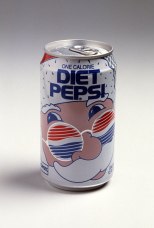
Seymour Chwast, Series 7: Pushpin Slides, Brand Design, ca 1980s-90s.

His work has been exhibited in major galleries and museums in the United States, Europe, Japan, Brazil, and Russia, including the influential “The Push Pin Style,” a two-month retrospective at the Louvre’s famed Musée des Arts Décoratifs. Chwast also has work in the permanent collections of the Museum of Modern Art and Smithsonian Design Museum, both in New York; as well as the Library of Congress and the Gutenberg Museum in Mainz, Germany. In 2015, Washington University’s Modern Graphic History Library acquired a complete collection of Chwast’s posters, intended for availability to students and the general public for research and study.

MD_ChwastS_GiftBoxes_640 
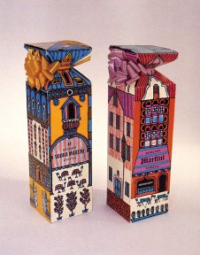
Seymour Chwast, Gift Box and Carton for Heublein Drink Mixes, Brand Design, ca 1950s.

“It may seem trite to call Seymour a consummate artist. Yet he is consumed by art.” A member of the Art Directors Hall of Fame and a recipient of the AIGA Medal, Chwast also holds honorary PhDs from Parsons School of Design, and the Rhode Island School of Design. He is a frequent lecturer, with recent speaking engagements at Design Indaba, Offset and Point Design Conference; and resides in New York City with his wife, Paula Scher, a graphic designer and painter.

Works influenced/inspired by Chwast

seymour_chwast_exhibition_ad_by_mattalaio 
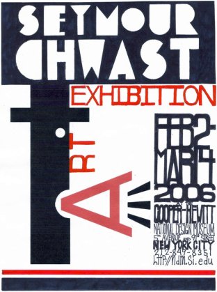
Matthew Alaio, Seymour Chwast Exhibition Ad, Advertising, 2006

logo_concepts_by_kaly89

Caroline Vegerano, Logo Concepts, Personal Logo, 2009

References

About Seymour. (n.d.). Retrieved February 19, 2016, from http://www.pushpininc.com/about/seymour/

Heller. S. (2016). The Revolutionary Seymour. Retrieved February 24, 2016, from http://www.seymourchwastarchive.com/about/seymour/

Seymour Chwast. (n.d.). Retrieved February 24, 2016, from http://www.designishistory.com/1960/seymour-chwast/


Tobias Frere-Jones

Tobias Frere-Jones was born in 1970 in New York, and is noted as having been an artist since youth. As a son of an advertising copywriter and print buyer, he was surrounded with all forms of letterforms all his childhood, and his adolescence years saw him between the galleries of Manhattan and the dockyards of Brooklyn. At the age of fourteen years, he began exhibiting paintings, sculptures and photographs in New York galleries.

By the time he entered Rhode Island School of Design, type design had displaced most other interests. He graduated, receiving a BFA in Graphic Design, in 1992; and began full-time work for Font Bureau, where he was a Senior Designer for several years. In addition to his numerous contributions to the Font Bureau retail library and custom work, Frere-Jones made three fonts (“Reactor”, “Fibonacci”, and “Microphone”) for Fuse, a journal of experimental type design. He spent seven years at the Bureau and was mentored and directed by David Berlow, and also created typefaces; namely, “Interstate”, “Poynter Oldstyle” & “Gothic”.

interstate Frere-Jones, Interstate, Font Specimen, 1993

Frere-Jones joined the faculty of the Yale University School of Art, in 1996, teaching typeface design alongside Matthew Carter. In 1999, he returned to his native New York, leaving Font Bureau and joining a friend, Jonathan Hoefler, at his company (which was later renamed, Hoefler & Frere-Jones Typography). They served clients from varied fields, such as The New York Times, The Guardian, The Sun, The Times, Esquire, Apple, IBM, HP, Kodak, Sony; and also did work for Nike, Gucci and the presidential campaign of Barack Obama.

sept-09 Frere-Jones, GQ Magazine, Magazine cover, 2009

He is the founder of Frere-Jones Type, and is widely recognized as one of the world’s leading type designers. His work is in the permanent collections of the Victoria & Albert Museum in London and the Museum of Modern Art in New York. In 2006, The Royal Academy of Visual Arts (in The Hague) awarded him the Gerrit Noordzij Prijs for his contributions to typographic design, typography and type education. In 2013, he received the AIGA Medal in recognition of exceptional achievements in the field of design.

Works influenced/inspired by Frere-Jones

the_cardigans_by_tordo-d20byrx Luis Enrique Cuellar Peredo, The Cardigans, Wallpaper, 2009

aligned_and_centred___akkurat_by_nekohdot NekohDot, Aligned And Centred – Akkurat, Digital art, 2009

References

Frere-Jones Type. (2015). Retrieved October 26, 2015, from http://www.frerejones.com/about/

Končal, P. (2010). Tobias Frere-Jones. Retrieved October 26, 2015, from https://designhistoryresearch.wordpress.com/category/tobias-frere-jones/

Tobias Frere-Jones. (2015). Retrieved October 26, 2015, from http://www.fontbureau.com/people/TobiasFrereJones/

De Stijl

Emerging from the Netherlands in 1917, De Stijl is explained as an art movement that involved an abstract yet simplified aesthetic; including geometric forms and primary colours. De Stijl (or “the style” in Dutch), was birthed in response to the horrors of World War I and the dream of remaking society, afterwards. Art was perceived as affording social and spiritual redemption, and “the members of De Stijl embraced a utopian vision of art and its transformative potential.” It was, in part, a reaction against the extravagance of Art Deco as well, and was intended to be a widely-used and appropriate visual language in the modern and highly spiritualized age.

42_destijl01 
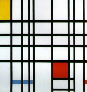
Piet Mondrian, Composition with Yellow, Blue, and Red, Painting, 1937-42

Led by its most celebrated proponents, painters Theo van Doesburg and Piet Mondrian, De Stijl artists worked with a variety of media and within diverse fields. “Promoting their innovative ideas in their journal of the same name, the members envisioned nothing less than the ideal fusion of form and function, thereby making De Stijl in effect the ultimate style.” As such, the movement’s artists engaged themselves in varying fine arts, as well as industrial design, typography, even literature and music. In architecture, which would include works by another key member, Gerrit Reitveld, De Stijl would realize its greatest influence, as it was embraced at the Bauhaus and also propelled the rise of the International Style of the 1920s and 1930s.

It was mainly architecture that realized both De Stijl’s stylistic aims and its goal of close collaboration among the arts. The Worker’s Housing Estate in Hoek van Holland (1924–27), designed by Jacobus Johannes Pieter Oud, expresses the same clarity, austerity, and order found in a Mondrian painting. Rietveld also applied its stylistic principles in his work; the Schröder House in Utrecht (1924), for example, resembles a Mondrian painting in the severe purity of its facade and in its interior plan.

1024px-Rietveld_Schröderhuis_HayKranen-20 Gerrit Reitveld, Schröder House, Architecture, 1924

Even though De Stijl artists created work embodying the movement’s utopian vision, their realization that this vision was unattainable in the real world essentially brought about the group’s demise. Ultimately, De Stijl’s continuing fame is largely the result of the enduring achievement of its best-known member and true modern master, Piet Mondrian.

Works influenced/inspired by Art Deco

modern_destijl_by_violetgraphica-d38uc8w Bouchra, Modern Destilj, Digital art, 2010

icopy___modern_style_de_stijl_by_staticx99 Alex Lafleur Beauchemin, iCopy – Modern style De Stijl, Digital art, 2009

References

De Stijl. (2014). Retrieved November 2, 2015, from http://www.britannica.com/topic/De-Stijl-art

De Stijl. (2015). Retrieved November 2, 2015, from http://www.theartstory.org/movement-de-stijl.htm

De Stijl. (n.d.). Retrieved November 2, 2015, from http://www.designishistory.com/1920/de-stijl/

Art Deco

Art Deco, also referred to as “style modern”, is a movement in the decorative arts and architecture that originated in the 1920s; spanning the boom of the roaring 1920s. As a major style, it developed in western Europe and the United States during the 1930s; in the midst of the Depression. Its name was derived from the Exposition Internationale des Arts Décoratifs et Industriels Modernes, held in Paris in 1925, where the style was first exhibited. Art Deco design represented modernism turned into fashion, and included individually crafted luxury items and mass-produced wares.

CIRC.526-1974_jar_1000px_custom_290x309_06200661 
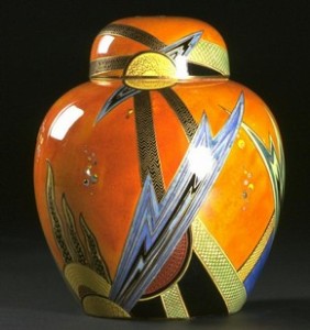
Enouch Boulton, Jazz jar and cover, Pottery, c. 1928

The actual term “Art Deco”, coined in the 1960s, affected all forms of design, from decorative arts like interior design, furniture, jewellery, textiles, fashion and industrial design, as well as to the applied art of architecture and the visual arts of film, photography, painting, graphics and product design. In every sense, the style drew on tradition and, at the same time, celebrated the mechanized, modern world. Often deeply nationalistic, it quickly spread around the world, dominating the skylines of cities from New York to Shanghai. It embraced both handcraft and machine production, exclusive works of high art and new products in affordable materials. Art Deco reflected the plurality of the contemporary world and, unlike its functionalist sibling, Modernism, responded to the human need for pleasure and escape.

34994_496197497081538_836990370_n Eric Rohman, “The Easiest Way”, Poster, 1931

Art Deco, like its forerunner Art Nouveau, was an eclectic style and drew on many sources; borrowing from historic European styles, contemporary Avant Garde art, the rich colours and exotic themes of the Ballets Russes, the urban imagery of the machine age, and more distant and ancient cultures (from the arts of Africa and East Asia). Archaeological discoveries fuelled a romantic fascination with early Egypt and Meso-America. But, in its application, the advance in resources would also play a significant part. Employing new building materials that were manipulated into stepped, radiating styles that contrasted sharply with the fluid motifs of Art Nouveau, Art Deco architecture represented scientific progress, and the consequent rise of commerce, technology, and speed (as exemplified in the Radio City Music Hall, in New York City’s theatre district and the ten-building complex of Rockefeller Center). This, together with its image as a modern, opulent style, made Art Deco designs especially suitable in varied applications. A three-dimensional example of Art Deco is found in the glass creations of the Frenchman, Rene Lalique. While he was a classic artist of Art Nouveau, he produced a special series of Art Deco glasses and bowls with geometric, floral, and stylized bird decorations.

Works influenced/inspired by Art Deco

art_deco_illuminating_clock_by_decoechoes Gilles Messier, Art Deco Illuminating Clock, Clock panel, 2010

art_deco_sky_light_by_muralsbylebold Michael LeBold, Art Deco Sky-light, Window with design, 1983

References

Art Deco. (2014). Retrieved October 26, 2015, from http://www.britannica.com/art/Art-Deco

Art Deco. (2015). Retrieved October 26, 2015, from http://www.vam.ac.uk/content/articles/a/art-deco/

Art Deco: c. 1925-40. Retrieved November 2, 2015, from http://www.visual-arts-cork.com/history-of-art/art-deco.htm

Art Deco: Introduction to an Art Movement. (2014). Retrieved November 2, 2015, from http://www.arthistory.net/artstyles/artdeco/artdeco1.html

Paula Scher

Paula Scher was born on October 6, 1948 in Virginia, and grew up in Washington DC and Philadephia. Her father was a photogrammetric engineer for the US Geological Survey who invented a device that ensured the distortion-free aerial photography. That encouraged her to create hand-printed maps. Scher later went on to study at the Tyler School of Art, Elkins Park, Pennsylvania, where she collected her Bachelor’s degree in Fine Arts in 1970; then travelling to New York where she began her professional career as a layout artist – working for children’s book division at Random House.

1007009 Paula Scher, Boston, Album cover, 1976

Afterwards, Scher worked in the advertisement and promotion department of the CBS Records and, in 1974, joined a competing label, Atlantic Records, as an art director; and where she used album cover art to expand her creativity and earned four Grammy nominations. Later, she returned to CBS Records and worked there for eight years producing over one hundred and fifty album covers, annually. These included Eric Gale’ “Ginseng Woman”, Bob James’ “H” and “One on One” and Boston’s “Boston”. Her contributions included reviving historical typefaces and design styles. In fact, she earned four Grammy nominations for her inspiring designs. She would, however, resign from CBS in 1982 and, along with former classmate, Terry Koppel, founded the firm of Koppel and Scher. For seven years flourished for seven years, during which time Scher developed corporate identities, book jackets, advertisement and packaging. The recession would lead to the dissolution of the firm, with Koppel leaving for the creative director position at Esquire Magazine. Scher joined the New York office of Pentagram, a world-leading design partnership, in 1991, as a partner. Scher worked in consultancy and eventually earned the post of principal; the first female to do so. Her expertise would also include teaching, as she had accepted a position at the School of Visual Arts. In addition to her work there for over two decades, Scher also taught intermittently at the Yale University, Tyler School of Art and Cooper Union, to name a few. Scher is also credited with the new identity creation of The Public Theater, where her promotional graphic system for the program became highly influential in theatrical promotion.

windows-8-branding Paula Scher, Windows 8 Branding, Brand identity, 2012

Scher has received more than three hundred awards by several international associations, AIGA, the Package Design Council and The Type Directors Club. Her collection of work is showcased at New York MoMA, the Museum für Gestaltung and the Library of Congress in Washington, DC. Scher’s style evokes bold imagery and uses typography in an almost illustrative rather than print style; and her work has included corporate identity and branding for the likes of Citibank, Coca Cola and Bausch + Lomb, as well as in the arts (with clients like Museum of Modern Art, New York Ballet, Metropolitan Opera and New York Philharmonic).

Works influenced/inspired by Scher

6a00d834522c5069e201157024ba4b970c-500wi Joanne Maguire, Artist Research, Poster, 2011

paula_scher_psalm_poster_by_delusionzofgrandeur-d510hyt Sara Christensen, Paula Scher Psalm Poster, Poster, 2012

References

Contemporary Graphic Designers – Paula Scher. Retrieved October 26, 2015, from http://idesigni.co.uk/resources/graphic-design/contemporary-graphic-designers-paula-scher

Famous Graphic Designers – Paula Scher. Retrieved October 26, 2015, from http://www.famousgraphicdesigners.org/paula-scher

Paula Scher. Retrieved October 26, 2015, from http://www.designishistory.com/1980/paula-scher/

Carol Twombly

Carol Twombly, born in 1959, spent much of her childhood in New England exploring various artistic disciplines, and settled on sculpture. She was a well-respected type designer, but she retired in 1999 in order to pursue other artistic interests. Prior, Twombly studied at the Rhode Island School of Design (RISD); following her brother who pursued studies in architecture. She opted for graphic design, as she viewed it as being useful and easily applicable discipline. Though graphic design became her career focus, Twombly had not abandoned her other artistic pursuits, which included basket-weaving. While at RISD, and under the tutelage of Professor Charles Bigelow (the designer of the Lucida, Apple Chicago, Apple Geneva, Wingdings and other types) and his partner, Kris Holmes, she became interested in type design and typography; and worked during summer months in their studio.

After graduation from RISD and a year spent working in a Boston graphic design studio, Twombly accepted an invitation from Bigelow to join a small group of students in a newly formed digital typography program at Stanford University. Carol continued to work for the Bigelow and Holmes studio for the next four years and, in 1984, entered her first type design in the Morisawa Typeface Design Competition (sponsored by Morisawa Ltd., a Japanese manufacturer of typesetting equipment). She won for the typeface, “Mirarae”, which went on to be licensed and released by Bitstream.

Mirarae Twombly, Mirarae, Font Specimen, 1984

Since 1988, she had been a staff designer at Adobe Systems, and during more than eleven years with Adobe, Twombly designed a number of very popular text and display typefaces. Designs like “Trajan”, “Charlemagne”, “Lithos”, and “Adobe Caslon” are inspired by classic letterforms of the past – from early Greek inscriptions, circa 400 B.C., to William Caslon’s typefaces of the 1700s – while “Viva” and “Nueva” explore new territory while maintaining traditional roots. In 1994, she received the prestigious Prix Charles Peignot award from the Association Typographique Internationale for outstanding contributions to type design (and given to outstanding type designers under the age of thirty five). She was the first woman and only the second American to receive this prestigious honour. In a time when most of the notable typeface designers have been men, Twombly is recognised as one of the 20th Century’s most influential designers. As a matter of fact, she would work, for years, in the type design department at Adobe, when many of the Adobe Originals typefaces were planned and carried out in the 1990s. But, since retiring and leaving Adobe, Twombly has continued to explore other non-computer-based arts including weaving, natural-object sculpture, silk painting, and more.

TwomblyFaces Twombly, Specimen of Typefaces, Fonts, date unknown

Works influenced/inspired by Twombly

d02cc7a10f76099652516adfd89c4d57 Jorge Martinez, Carol Twombly Trajan 1989 Poster, Poster, 2013

roscover-coke-tweets photo-3-675x900 Dylan Roscover, Coke Tweets, Illustration, date unknown

References

Carol Twombly. Retrieved October 26, 2015, from http://www.adobe.com/products/type/font-designers/carol-twombly.html

Carol Twombly. Retrieved October 26, 2015, from http://www.identifont.com/show?122

Friedlander, J. (2010). Carol Twombly, An Extraordinary Type Designer. Retrieved October 26, 2015, from http://www.thebookdesigner.com/2010/03/carol-twombly-an-extraordinary-type-designer/

Saul Bass

Saul Bass was born on May 8, 1920 in Bronx, New York, but moved to Los Angeles in his mid-twenties in order to pursue a career in Graphic Design. He was extraordinarily diverse and talented, where it regarded design, as he worked in both print design and movie animation. Bass was perhaps best known for his design of film posters and title sequences. During his 40-year career Bass worked for some of Hollywood’s greatest filmmakers, including Alfred Hitchcock, Stanley Kubrick, Otto Preminger, Billy Wilder, and Martin Scorsese. He became well-known in the film industry after creating the title sequence for Otto Preminger’s “The Man with the Golden Arm” in 1955.

Screenshot 2015-10-25 15.50.15 Bass, Opening Titles for Psycho (1960), Screenshot, 2015

For Alfred Hitchcock, Bass designed effective and memorable title sequences, inventing a new type of kinetic typography, for “North by Northwest”, “Vertigo” (in collaboration with John Whitney), and “Psycho”. In addition, Bass also designed some of the most iconic corporate logos in North America, including the original AT&T “bell” logo in 1969, as well as their “globe” logo, which came later in 1983. He also designed Continental Airlines’ “jetstream” logo (in 1968) and United Airlines’ “tulip” logo (in 1974), all of which became some of the most recognized logos of the era.

0 Bass, AT&T (Globe logo), Corporate Logo, 1983

In 1955, Elaine Makatura, began to work with Bass; with both getting married working on the opening title sequence to “Spartacus” (1960), and producing mostly collaborative work thereafter. After the birth of their children, Jennifer in 1964 and Jeffrey (in 1964 and 1967, respectively), the Basses concentrated on their family, short films, and title sequences. Their first joint venture into short filmmaking was with promotional films for pavilions at the 1964 World’s Fair, “From Here to There for United Airlines” and “The Searching Eye for Eastman Kodak”. In 1968, the creative couple made the Oscar-winning short film “Why Man Creates”.

Toward the end of his career, Bass was “rediscovered” by James L. Brooks and Martin Scorsese, who urged the Basses to return to main title design. For Scorsese, they created title sequences for “Goodfellas”, “Cape Fear”, “The Age of Innocence”, and “Casino” (done in 1995 and would be their last title sequence and a picture of Bass’ revered and often imitated legacy). In a sense, all modern opening title sequences that introduce the mood or theme of a film are a legacy of the Basses’ work.

Works influenced/inspired by Bass

saul_bass_inspired_hunger_games_poster_by_deathlytriforce-d5iwrr3 Catherine, Saul Bass-inspired Hunger Games Poster, Poster, 2012

SBstraitjacket Rob Kelly, Saul Bass’ Strait Jacket, Poster, 2011

References

Henderson, K. (2012). 20 Graphic Designers You Should Know. Retrieved September 24, 2015, from http://www.complex.com/style/2012/03/20-graphic-designers-you-should-know/15

Saul Bass. Retrieved on October 25, 2015, from http://www.artofthetitle.com/designer/saul-bass/

Eric Gill

Eric Gill (born Arthur Eric Rowton Gill) on February 22, 1882 in Brighton, England, was son to a non-conformist minister and raised in a cult. From 1899 to 1903, Gill apprenticed to an architect in London, he became smitten with the world of calligraphy or lettering. This was evoked through classes that he attended, given by Edward Johnston at the Central School of Arts and Crafts in London. He was profoundly influenced by Johnston’s dedicated approach to work and decided to join the world of the Arts and Crafts.

It is said that Gill, during his lifetime, set up three self-sufficient religious communities where, surrounded by his followers and attendants, he continued work as a sculptor, sign painter, wood-engraver and type designer. He also wrote constantly and prodigiously on his favourite topics; those being, social reform, the integration of the body and spirit, the evils of industrialisation, and the importance of the working man. In 1905–09, Gill produced initials and book covers for Insel publishers in Leipzig; and designed initials for the Ashedene Press in 1906. In 1907, he moved to Ditchling, Sussex, where he produced stone sculptures, including a few for the BBC building in London. He converted to Catholicism in 1913 and this influenced his sculpture and writings. While devout, he was known for his unusual sexual behaviour; suggested to be pedophilia and incest.

Eve_by_Eric_Gill Gill, Eve, Engraving, 1911

In 1914, Gill produced sculptures for the stations of the cross in Westminster Cathedral in London. He worked for the Golden Cockerell Press from 1925 to 1931, where he produced initials, illustrations and an exclusive text type. Having moved to Pigotts near High Wycombe in 1928, he worked at the London Underground’s administrative headquarters. Thereafter, he and his son-in-law founded their own hand-press, which printed luxury bibliophile editions. His work continued, as in 1930, Gill created illustrations for the last number of “The Fleuron” magazine, and was made a Royal Designer for Industry in 1936. Another of his well-known works is the stone tablets for the League of Nations building in Geneva, done in 1938.

1024px-Eric-Gill---Nude-woman-reclining-on-a-leopard-skin-(1928) Gill, Nude woman naked reclining on a leopard skin, Graphite drawing, 1928

He designed his first typeface, “Perpetua”, for Stanley Morison who had badgered him for years on this matter. Of all the eleven typefaces that he designed, “Gill Sans” is his most famous and most widely used; a clear modern type and became the letter of the railways – appearing on their signs, engine plates, and timetables. The typeface was strongly influenced by the London Transport lettering of his teacher Edward Johnston, was the first successful sans type based on the humanist models of the Renaissance. Gill’s best known type designs were produced by the Monotype Corporation, although he also designed type for private presses. Another of his designs is “Joanna”, named after his daughter. Gill died on November 17, 1940, and is noted as having described himself, on his gravestone, as a stone carver.

Works influenced/inspired by Gill

EricGill--GillSans-1926-Poster-by-DanielleBello-2014 Danielle Bello, Eric Gill Gill Sans 1926 Poster, Poster, 2014

396px-GillSansEG_svg Jim Hood, Specimen of the typeface Gill Sans, Typeface, date unknown

References

Eric Gill. Retrieved October 25, 2015, from http://www.identifont.com/show?12W

Eric Gill. Retrieved October 25, 2015, from https://www.myfonts.com/person/Eric_Gill/

Font Designer – Eric Gill. Retrieved October 25, 2015, from http://www.linotype.com/391/eric-gill.html

Milton Glaser

Milton Glaser was born on June 26, 1929, and educated at the High School of Music and Art and the Cooper Union art school in New York. Through a Fulbright Scholarship, he furthered his studies at the Academy of Fine Arts in Bologna, Italy. But Glaser’s life has been about creating spaces for artistic development and production, platforms for expressions, and collaborative work. In 1954, along with fellow Cooper Union graduates Seymour Chwast, Edward Sorel, and Reynold Ruffins, Glaser founded the revolutionary Pushpin Studios. Alongside Chwast, he directed the studio for the next twenty years, while it grew as a major contender and reference in the practice of graphic design, globally. He also founded the New York Magazine in 1968, with Clay Felker, and established Milton Glaser, Inc. some six years later. Added to this, he joined with Walter Bernard in 1983, forming the publication design firm, WBMG; who boast clientele like “LA Times”, “Boston Globe”, “Time”, “AdWeek” and “Brill’s Content”.

iHeartNy-8744 Glaser, I ♥ NY, Logo, 1977

Throughout his career, Glaser has been a prolific creator of posters and prints, including the infamous I ♥ NY logo which is proudly worn by many tourists to the city and residents alike. His artwork has been featured in exhibits worldwide, including one-man shows at both the Centre Georges Pompidou in Paris and the Museum of Modern Art in New York. His work is in the permanent collections of many museums. Glaser also is a renowned graphic and architectural designer, and is an influential figure in both the design and education communities; having contributed essays and granted interviews extensively on design. Among the many awards throughout the years, he received the 2004 Lifetime Achievement Award from the Smithsonian Cooper-Hewitt, National Design Museum, for his profound and meaningful long-term contribution to the contemporary practice of design.

70307-740x740-1345562610-primary Glaser, The Secret of Art, Print, 2008

To many, Glaser is the embodiment of American graphic design during the latter half of the 20th Century, and he continues to be quite a formidable force in the process and practices of graphic design. He is regarded as being immensely creative and articulate; a modern renaissance man and one of a rare breed of intellectual designer-illustrators. Glaser brings a depth of understanding and conceptual thinking, combined with a diverse richness of visual language, to his highly inventive and individualistic work.

Works influenced/inspired by Glaser

milton_glaser_calendar_by_b0bisabuilder Alfonso, Milton Glaser Calendar, Typography Calendar, 2008

14966e499e513c59812a0b096d3fe46e Trenay Moodley, Erykah Badu Tour Poster, Poster, 2014

References

Henderson, K. (2012). 20 Graphic Designers You Should Know. Retrieved September 4, 2015, from http://www.complex.com/style/2012/03/20-graphic-designers-you-should-know/15

Milton Glaser. Retrieved October 25, 2015, from http://www.miltonglaser.com/milton/#0

Walter Gropius

Walter Adolph Gropius was born May 18, 1883, in Berlin, Germany. His father was an architect, and Gropius followed suit, studying in Munich (from 1903-1904) and in Berlin-Charlottenburg (from 1905-1907). He also worked briefly in an architectural office in Berlin (1904) and served in the military (1904–05). Before completing school, Gropius built the farm labourers’ cottages in Pomerania in 1906. For a year, he travelled in Italy, Spain, and England and, in 1907, joined the office of the architect Peter Behrens in Berlin, in whose practice his lifelong interest in progressive architecture and interconnection of the arts would be shaped.

Fagus_Werk_Alfeld_Leine_vorne Gropius, Fagus Works (Fagus-Werk), Factory, 1911

However, he left Behrens in 1910, and established his own architecture practice in Berlin. His collaborative efforts are also noteworthy, in his work with Adolph Meyer in the design of the Fagus Works at Alfeld-an-der-Leine (in 1911) and the model office and factory buildings in Cologne (in 1914) done for the Werkbund Exposition. During that World War I, Gropius served as a cavalry officer on the Western Front, was wounded, and received the Iron Cross for bravery. In 1915 he married a widow, Alma (Schindler) Mahler, but they divorced in 1919. Their only child, Alma Manon, died in 1935.

027_154_haus_sommerfeld_0_0 Walter Gropius and Adolf Meyer, Sommerfeld House, Residence, 1920-1922

In April 1919, he became director of several schools, all of which were immediately united as Staatliches Bauhaus Weimar (“Public Bauhaus Weimar”). Gropius resigned as director of the Bauhaus in 1928 to return to practice privately as an architect in Berlin. From 1929 to 1930, he designed a portion of a housing colony in Berlin–Siemensstadt. Unsympathetic to the Nazi regime, he and his second wife, Ise Frank, whom he had married in 1923, left Germany secretly via Italy for exile in England in 1934. Gropius’ brief time in England was marked by collaboration with the architect Maxwell Fry that resulted in their important work, Village College at Impington, Cambridgeshire (in 1936).

In February 1937, Gropius arrived in Cambridge, Massachusetts, to become professor of architecture at Harvard University. The following year, he was made chairman of the department, a post he held until his retirement in 1952. In addition, Gropius collaborated with Marcel Breuer, a former Bauhaus pupil and later fellow teacher, from 1937 until 1940. In 1946, with six of his former Harvard pupils as partners, Gropius formed The Architects Collaborative (TAC), based in Cambridge; realizing many great projects, including the Harvard University Graduate Center (1949–50) and the United States Embassy in Athens (in 1960). Gropius exerted a major influence on the development of modern architecture, and died on July 5, 1969, in Boston, Massachusetts, U.S.A.

Works influenced/inspired by Gropius

DD20100720-faucets-4 Waterworks, The Henry Collection, Bathroom fittings, 2010

Kendall Albers Foundation 31 LR Eoghan Hoare, Director’s Waiting Room, Josef and Anni Albers Foundation building, 2015

References

Walter Gropius. Retrieved October 25, 2015, from http://www.britannica.com/biography/Walter-Gropius

Walter Gropius. Retrieved October 25, 2015, from http://www.walter-gropius.com/